
Table of Contents
Perhaps one of the most useful features with which Microsoft Excel is equipped is the pie chart making tool. Excel pie charts range from the very basic, simple models to more complex pie charts that encompass a larger number of variables. In this article, we will discuss how to make a pie chart in Excel.

*This post may contain affiliate links. As an Amazon Associate we earn from qualifying purchases.
We will show you the general principles of how to make a pie chart in Excel. Using these steps, you can make a pie chart in Excel 2010, Excel 2013 and most other versions of Excel. There may be some slight differences as to how the tabs are called, and where exactly you can find them. But all and all, you should be able to create a pie chart easily, regardless of the Excel version you are using. We’ll also talk a little bit about the basic pie chart types, and circle graph options in Excel.
How to Make a Pie Chart in Excel
There are three types of pie chart which we will be approaching – regular 2D or 3D pie charts, exploded 2D or 3D pie charts, and pie of pie or bar of pie charts. Depending on what you need, you can use whichever one is best suited for your task. But before we get into that, let’s first see the process to make a pie chart in Excel.
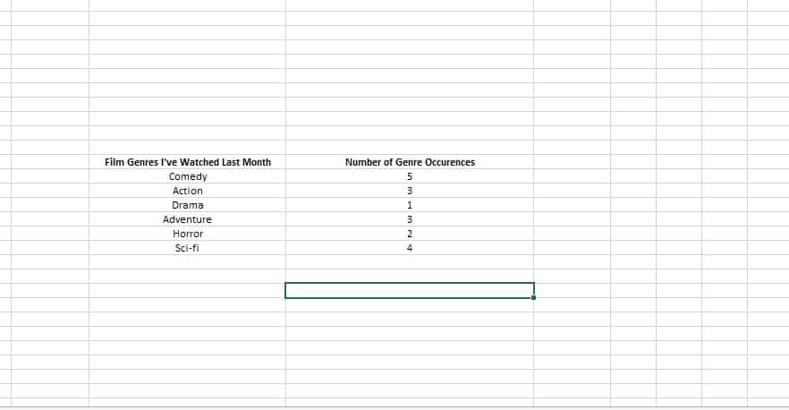
- Open an Excel document
- Select two adjacent columns
- Title each column (simply write what the column represents above each set of data)
- Insert your data in each of the columns
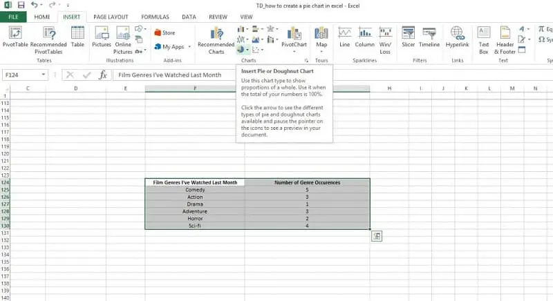
5. Go to the Insert tab of your Excel document
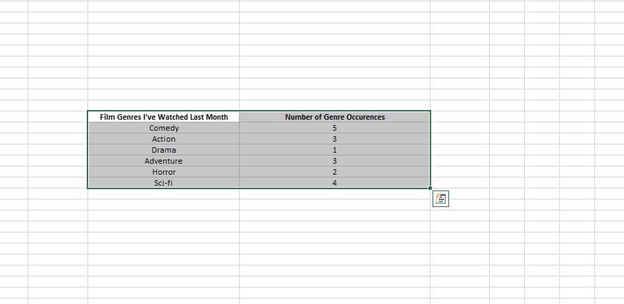
6. Drag and select the cells relevant to the pie chart
 7. Look for the Charts section
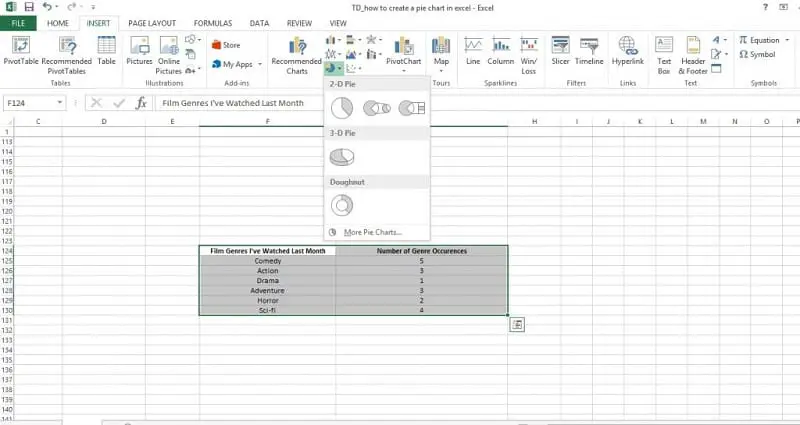
 8. Select the pie chart
9. Select the type of pie chart you need
10. Click on it or on Done (depending on your version of Excel)
This is how to make a pie chart in Excel. For further reference, it’s a good idea to keep these tips in mind when you consider how to make a pie chart in Excel:
- If you don’t name each column, you won’t get a denomination for the chart
- Make sure you select every single cell
- Select the proper type of pie chart for your needs
- Try not to include more than 6 or 7 categories
- Use a pie of pie or bar of pie chart if necessary
Now that you know how to make a pie chart, let’s talk about your chart needs, let’s take a look at the pie chart options and how you can use these graphs.
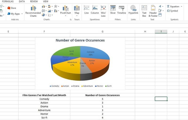
Regular Pie Chart
This particular brand of pie chart is for fans of the classic. It is primarily used to display up to six or seven slices. You can add more slice to this type of Excel pie chart. However, it will be more difficult to read.
The regular pie chart comes in 2D and 3D, and each individual slice can be dragged away from the center to highlight its importance.
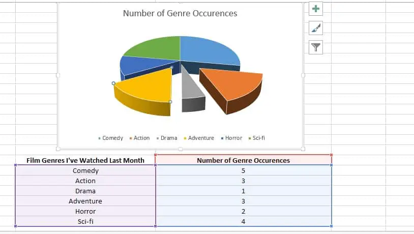
Exploded Pie Chart
The exploded pie chart also comes in 2D and 3D. What it does is to display the contribution of each value to the total, while also emphasizing each individual value.
You can customize the settings for each individual slice of pie, making for a very useful tool when you want to display a larger amount of information.
A downside would be that you cannot move the pie slices around. If you only want some slices to be exploded, you should go for the regular pie chart (in either 2D or 3D).
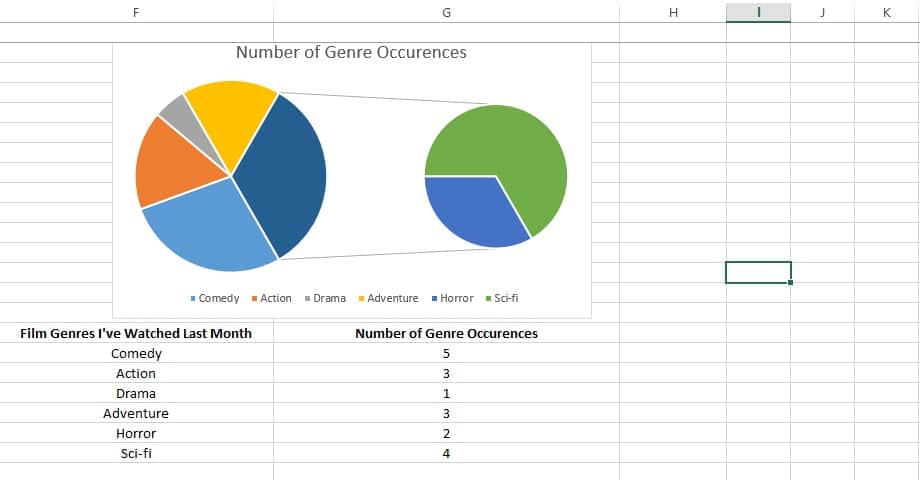
Pie of Pie and Bar of Pie
These two options are variations of the same function, one of them a bar and the other another pie. What this particular feature does is to extract certain slices from the main pie chart and display them in a separate, smaller one in order to emphasize them.
The pie of pie and bar of pie function is primarily used when there is too much information in the main pie chart. It usually displays the three smallest slices separately, but you can change those settings at any time.
What makes pie charts so useful is their simple way of representing complicated statistical relations between different sets of data. That’s why we recommend you never try to complicate a pie chart, if you don’t really need it. The basic Excel pie chart options are often enoug to get the point across.
If you know any other ways how to make a pie chart Excel, feel free to add your insights in the comments section.
Image source: Microsoft Excel